Aquablight Test Scheme: Part 6
Other ideas.
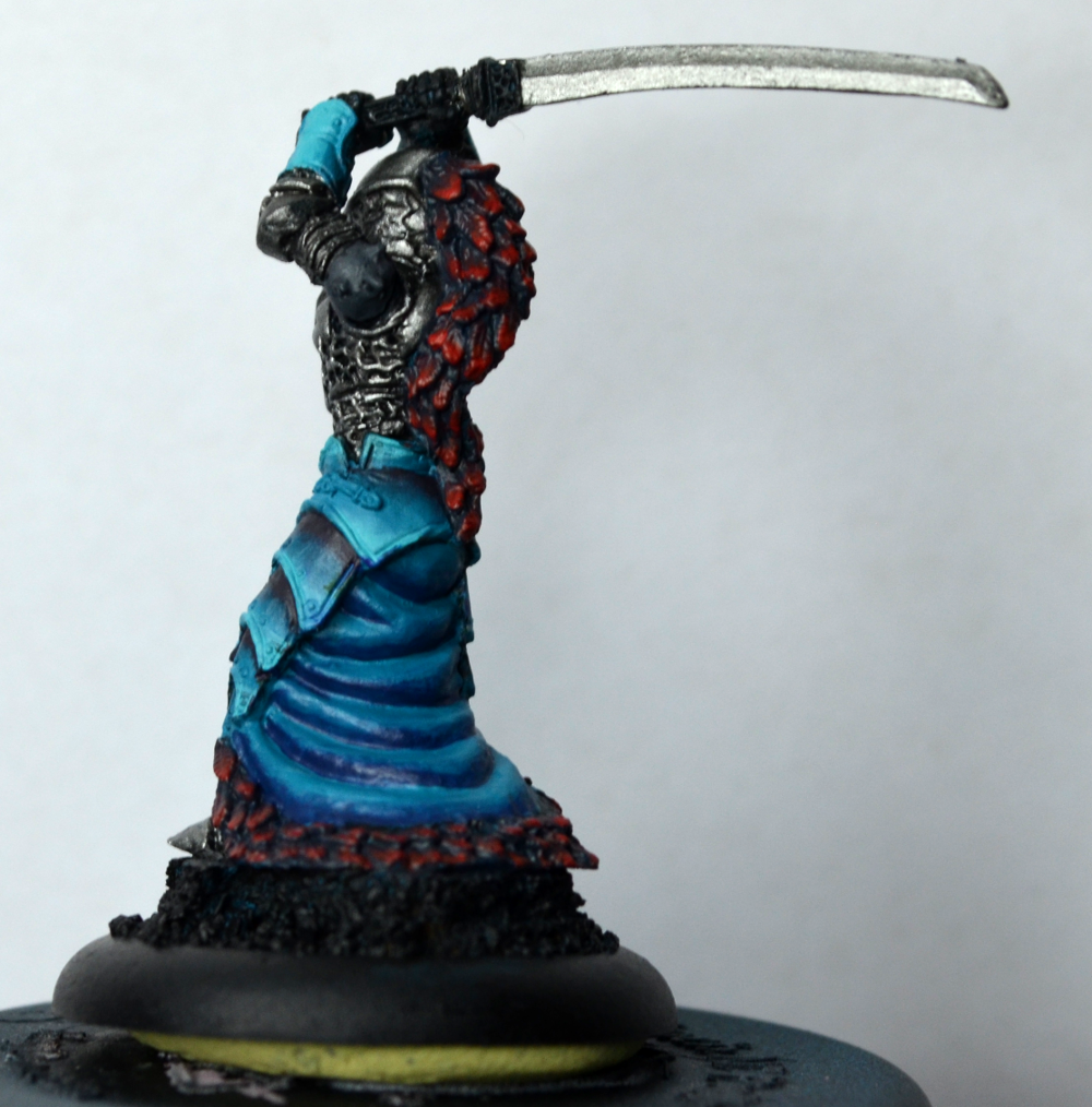
I pestered Meg, from Arcane Paintworks, about this issue, since she’s a color theory expert, and one of her bits of feedback was that the teal feathers ran into the teal armor pads. It read as all the same thing, which is definitely not what I was going for. So, to try out something different, I moved the red to the feathers, and darkened it a bit to help counteract the brightness of the teal armor. Then, I painted the skirt with black, and highlighted it with purple, to bring that back in to see how well it played with the red.
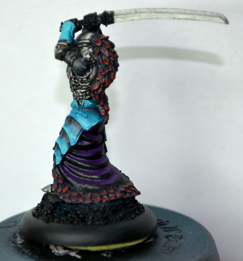
Yeah, not so much. The purple and red don’t play well together, but I had to at least try it. I went back over the skirt with Coal Black, shaded with black.

Good, but now it felt too dark. So, I brightened the red feathers just a touch, then I basecoated the skirt with the Meredius Blue I had originally started with weeks ago, and this time, shaded with Exile Blue – the same shade I used on the Harrier wings.

Not terrible, but still not really screaming “This is the one!” at me yet.
I don’t mind the red feathers as much. Certainly seems more plausible at least. That skirt is problematic though. I’d say white, but that’s not really a great idea. Red White and Blue Legion. Yeah… I’m standing by my grey I think. Kind of a military steel grey. Something that looks natural, like a color of cloth that Legion could put out in an efficient manner for a rapidly assembled force. That brings together natural colors or at least easily created ones, easily dyed. Steel grey meets all those requirements, and doesn’t fight with any of the current colors for attention.
Jedianakinsolo
I still maintain that the red shirt is the way to go. I agree about the teal feathers though, nix them. If you did red, a biege-ish/white feathers would work without blending in too much to the other colors.
volt_ron
If you’re set on red (and I think you should be!), then you need to match it with a dusky yellow/yellow-orange. It’ll contrast nicely with the teal for added pop and complement the red.
Kate
The red feathers are nice. It doesn’t seem like any of the colors for the cloth are working all that well, though. Have you thought about a cream color? Kate’s comment about a dusky yellow/yellow-orange might be good, though.
Martin_Fierro
I think you need something neutral on the skirt. Jedianakinsolo’s suggestion of grey could work, so could Martin_Fierro’s cream, or maybe a deep brown (now that you’re not going for a fully cold palette). I think the key is not to distract from the red/teal.
Border Prince
When I get really stuck on colour schemes I bounce to this website for ideas.
http://colorschemedesigner.com
You already have a core concept to work from with the blue this may give you a good spring board to find some alternate colour selections.
Liz
I’m really impressed this one model has taken so well to successive layers and that you have the patience & memory to think about them one at a time and not side by side.
Hawk
what color red did you use for the feathers? was that just sanguine base?
Creo