Showcase: Father Knight
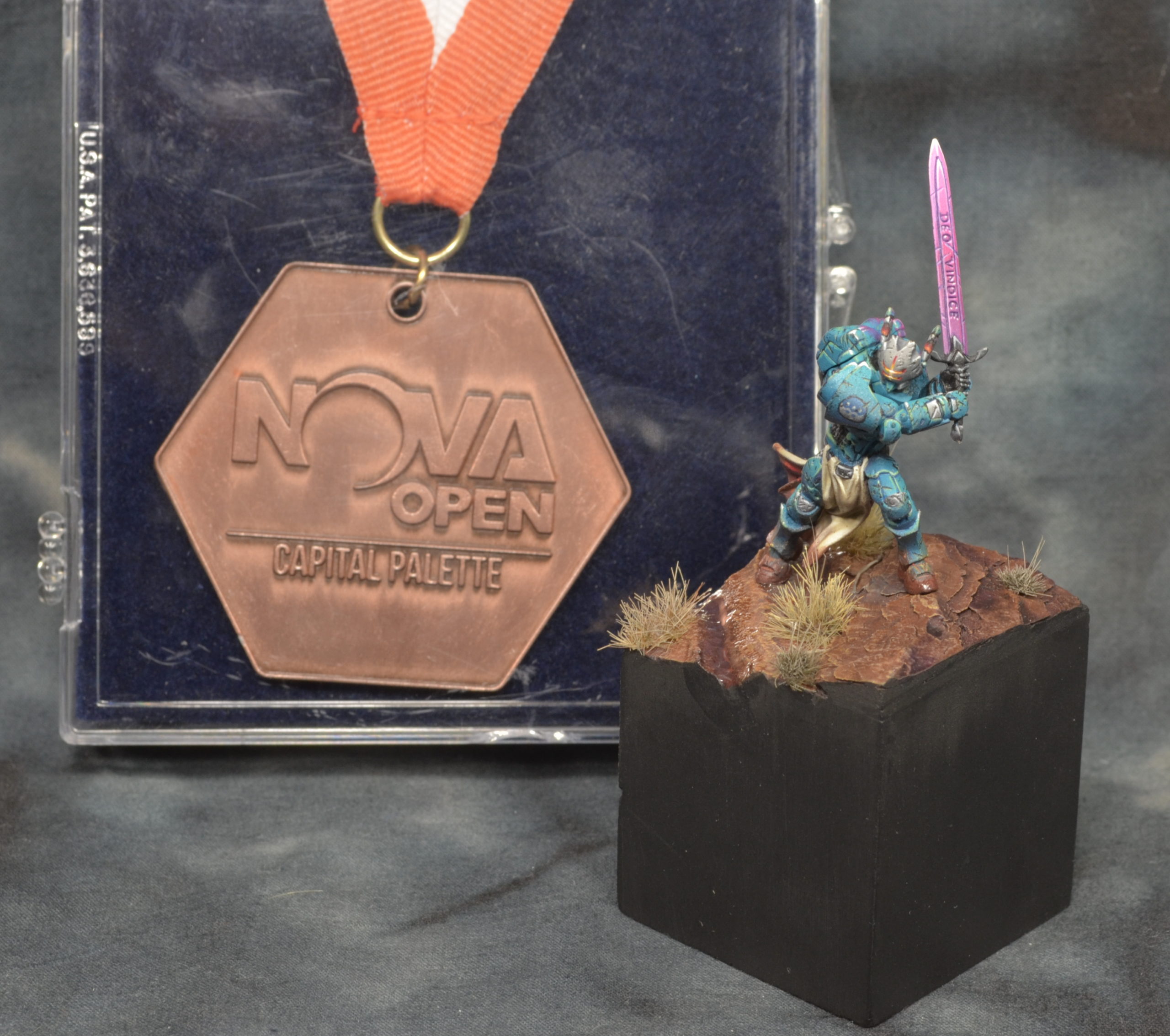
During the month of August, I set commission work aside and worked on an entry for the Capital Palette (Nova Open’s painting competition), and Mayacast’s Q3 Masterglass competiton.
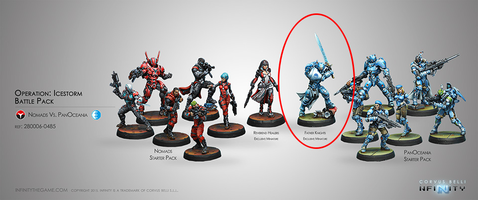
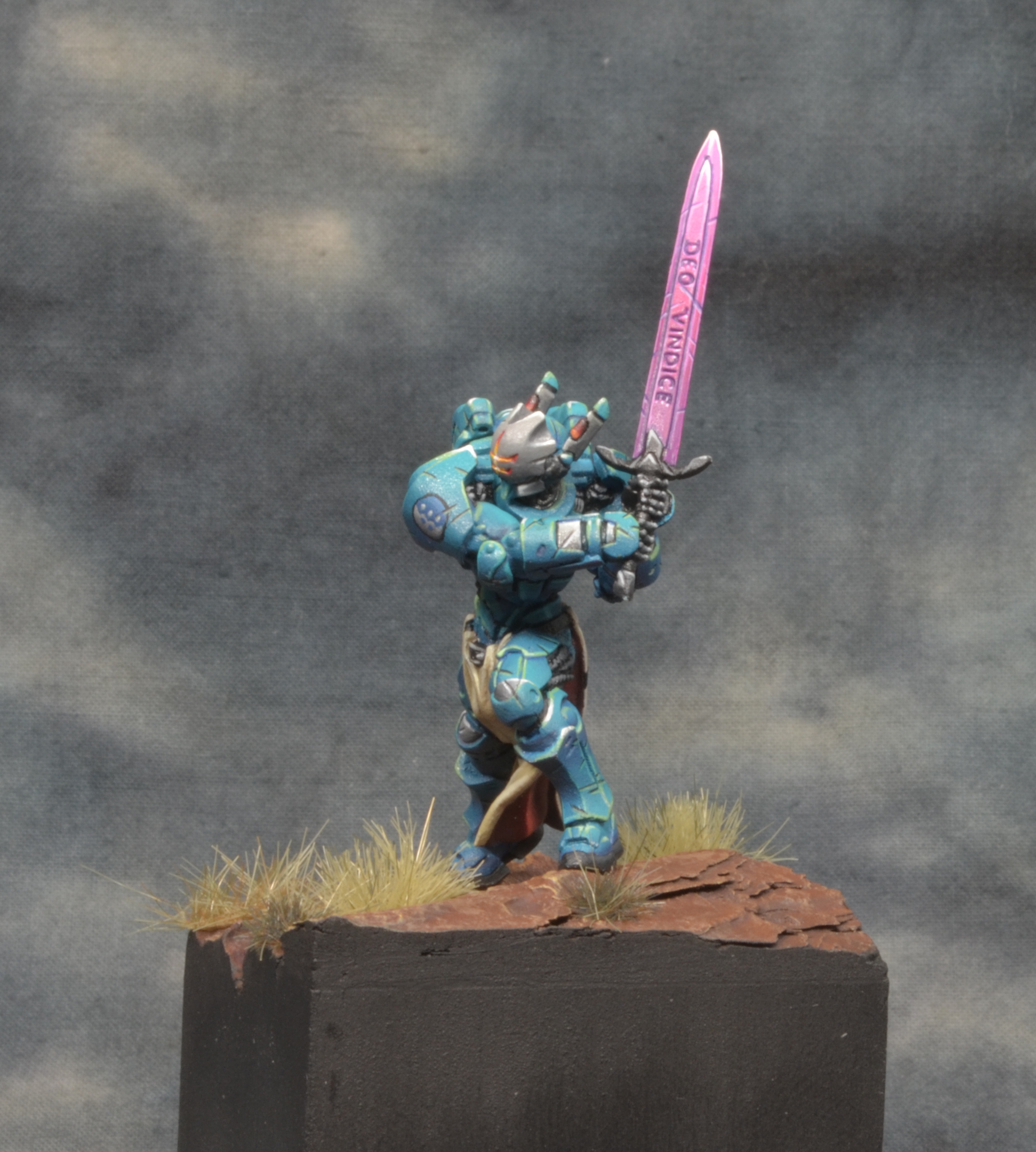
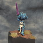
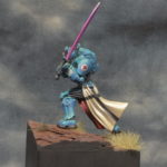
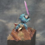
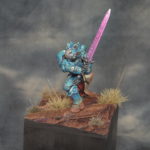
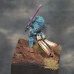
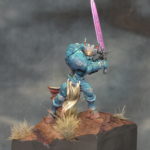
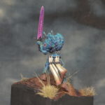
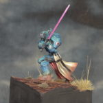
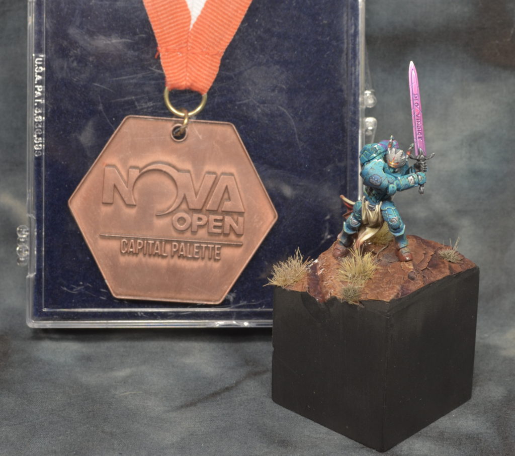
The model I chose was the Panoceania Father Knight model from Infinity’s Operation: Icestorm set.
Color Choice
My original idea with this model was to make a centerpiece for my fledgling Infinity army. With that in mind, I wanted blue/green armor and reddish / Martian sand for the base. I wasn’t sure what I wanted to do for the sword, but I was inspired by the Swiss Guard model in Infinity’s recent expansion of the Icestorm starter, so I went with hot pink – something that would be rather striking off the large amount of blue armor.
The Process
I’m fairly used to factory-fresh paint jobs, so after some time with the airbrush and 2-brush blending, I arrived at a nicely blended (but somewhat boring) model.
At this point, I’d also decided to commit to this being a display piece, and built a plinth. I used a 1.5″ cube, and carved away at one corner. I also used some cork to build up a rock for him to be standing on, rather than the tactical junk which would be somewhat out of place in my desert setting.
At this point, I mustered the gumption to add some weathering. Looking at the studio models, I noticed they added texture to the armor through small scratches. So, I added some, but I was very heavy handed compared to what Angel Giraldez and the other studio painted achieve. While I was working on the scratches, I also added emblems to each shoulderpad. One is the faction symbol, the other is the Knight’s holy order (Father Knights).
Other additions include initial placements for grass tufts (not yet glued on), and some painting on the rock and dirt. I also decided that I liked the idea of clean sides, so I trimmed the bark rock down to fit the shape of the plinth. This required some putty work to fill in and smooth out the sides, but when painted black, it mostly disappears.
Unhappy with the blatant, ham-fisted scratches, I tried to hie them in the noise of a whole lot more weathering. This was done mostly with a sponge, and a little by hand where the sponge couldn’t reach. After sponging on a black-brown, I went through and underlined all of them in an appropriate highlight color to make them look more 3-dimensional. I increased contrast on both the model and base using purples. Purple is a great shadow for blue/green and orange, because it’s near-complimentary to all of those, and using the same tone helps tie the model to the base.
Lastly, some water effects, because water effects. That always gets you bonus points, right? Yeah…
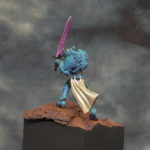
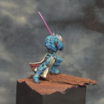
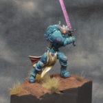
In the end, he earned a bronze at the NOVA Open, which I was very happy with; especially considering this was really my first foray into building a strictly for-display piece.

Fantastic work. I especially like the red dust weathering on the lower half, it does a great job of blending him into his environment. 🙂
Making him feel like he’s been slogging it was definitely a goal – I’m glad that comes through. Thanks, Spud!