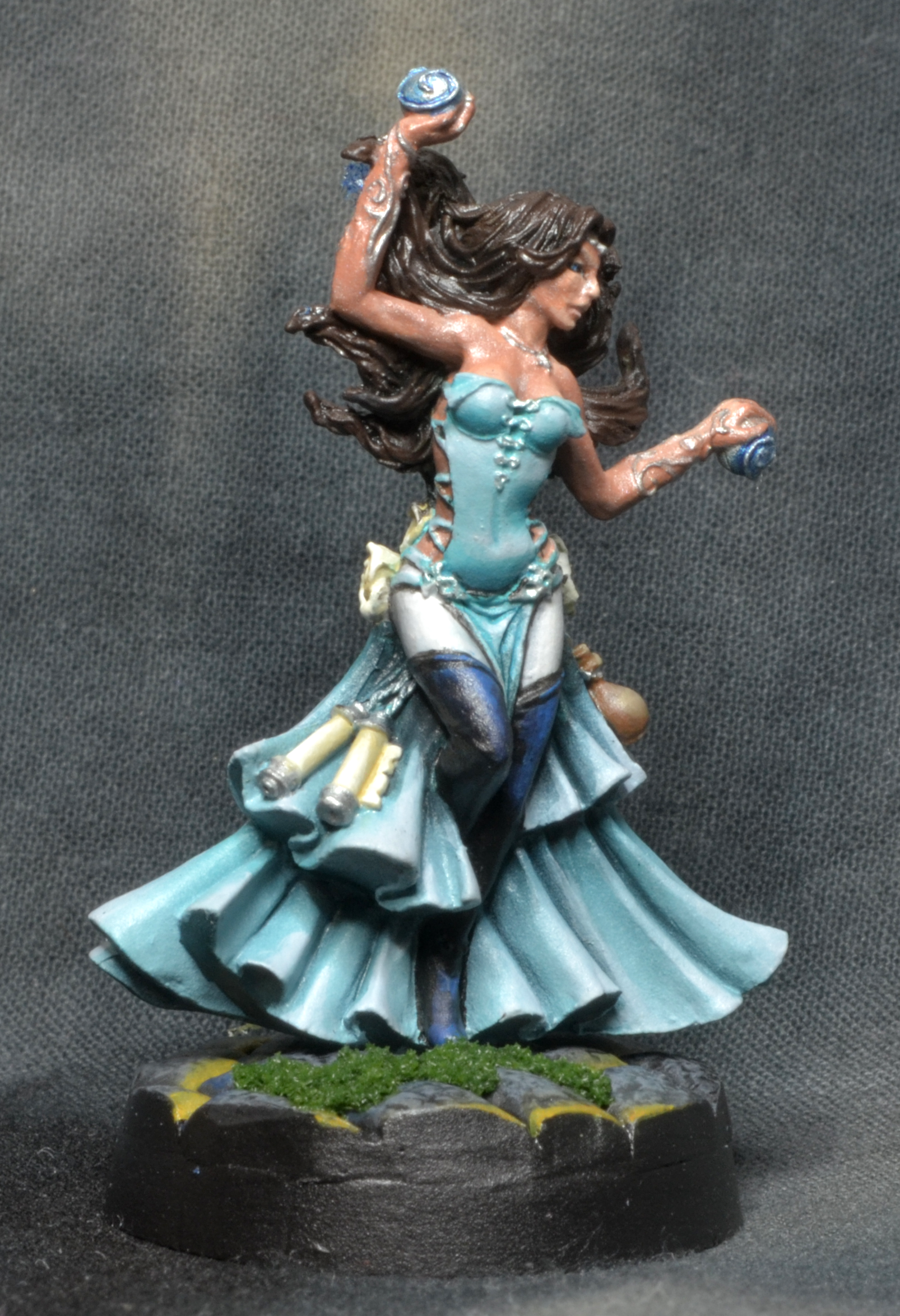
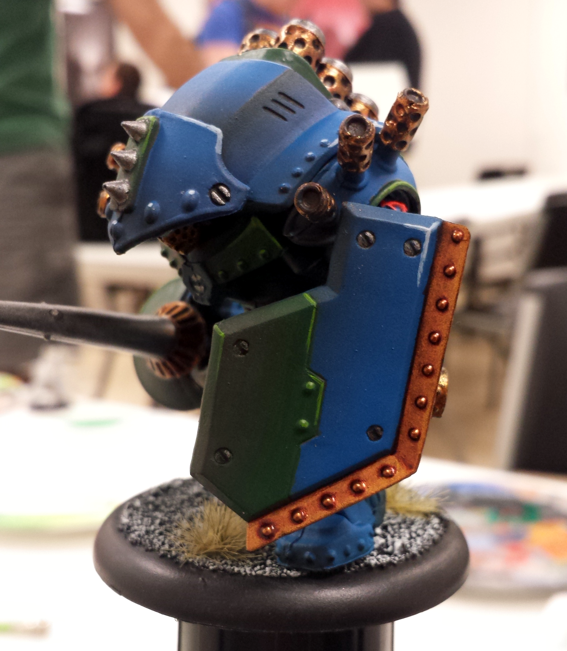
Tip: Desaturated photos

Consistently, the piece of advice I get and give out at critiques is “more contrast”. Contrast adds interest and captivates the viewer, and models that don’t have contrast seem flat and therefore boring.
I recently learned that there are several forms of contrast available to painters, but the first one that most painters conquer is light-dark contrast. In short, shadows and highlights. In color theory, this is called value, and represents the lightness of color. Not a color’s closeness to white, but it’s brightness, luminosity.
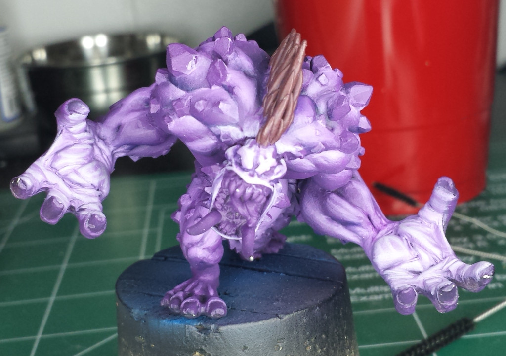
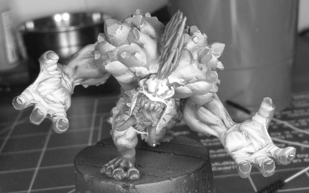
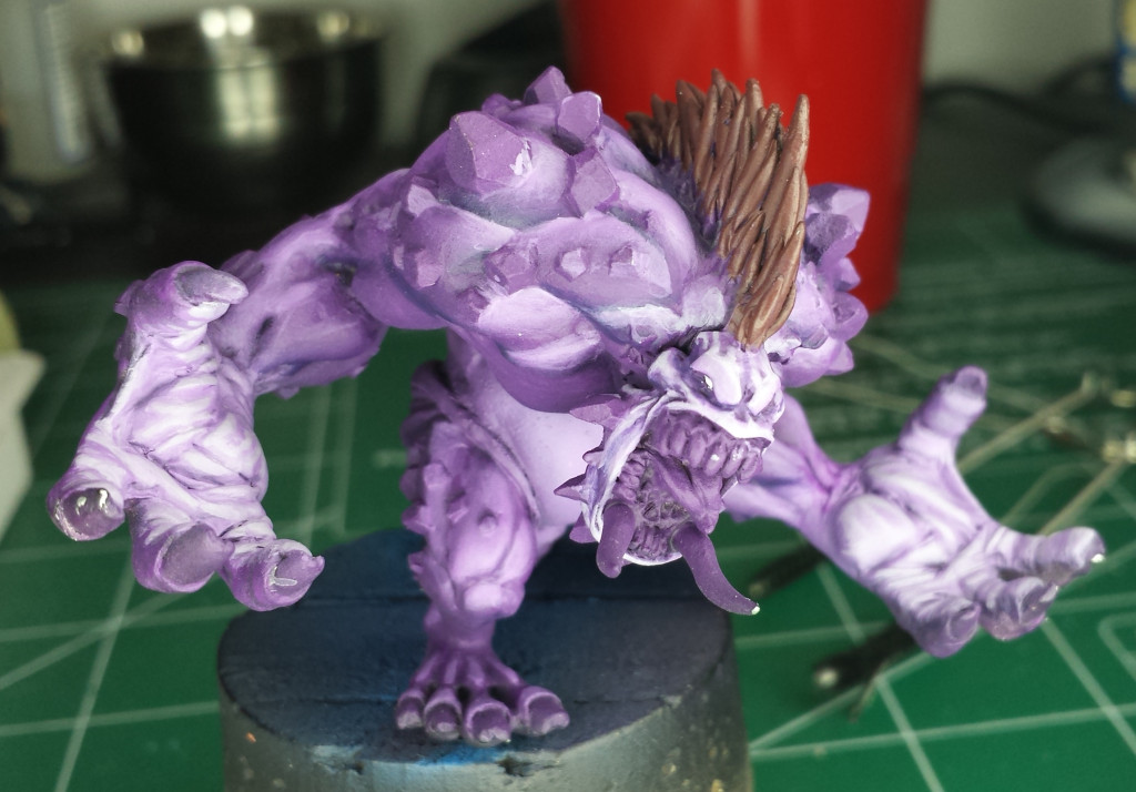
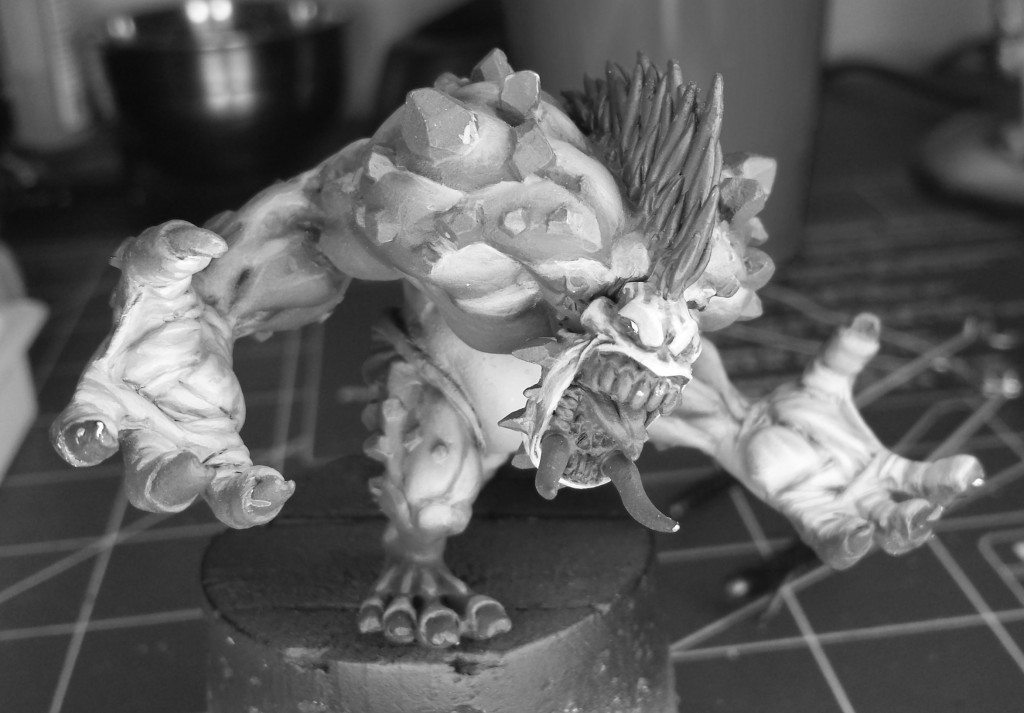
Here’s a quick method for testing the light-dark contrast on your models: use desaturated (black and white) photos.
What makes this super easy to use is that this feature is available on most smart phones. All you need to do is take a picture of your well-lit miniature, and apply a greyscale filter.
Looking at the above pictures, I see a few spots that I need to adjust. For instance, the eyebrows meld straight into the forehead. The hands
The biggest issue with this method is the finish of the paint you use. If your paints have a satin finish (slightly shiny) then the reflections of your light source may produce false light spots. Keep that in mind when photographing your models.

