Stinger and Seraph of Aquablight
I’ve been taking a break from blogging, lately, as I’m sure you may have noticed. Work has been rather draining lately, and after the huge amount of work that was the NOVA and our local 12-week Journeyman league, I just needed a break.
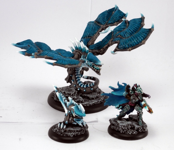
About two weeks ago, I showed off my new Aquablight scheme, on Lylyth1, Herald of Everblight. Last week, I finished up that same scheme on a Stinger, but my camera gave me issues, and I just decided to hold off showing it until I got my next item done.
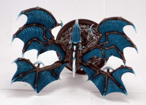
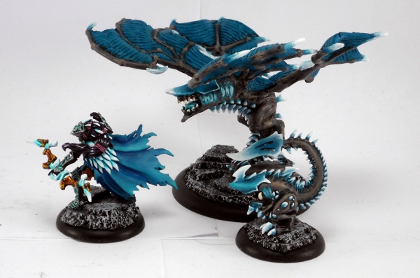
I was looking for a Heavy beast to work on, but I didn’t want one I particularly cared about. I stumbled across my used, stripped Seraph, and decided this would be my test subject. It turned out to not be a great choice, because there’s not very much chitin on it, which is the more interesting part of my scheme. However, It was fairly quick to paint, since the wings were just Meridius Blue with watered down P3 Turquoise Ink washed over top.

I think, now that I see it by the other two models, that I need more Arcane Blue on the head, which looks considerably darker than the Stinger’s head. Either that, or the Stinger’s head needs to be darkened a bit.

I also took a day and re-worked Lylyth’s armor. I was discussing with local player Ron, and his suggestion to use a super bright metallic as the base for the armor, before laying in the wash. This was a great thought, and ended up brightening the color in the armor considerably.

I’m taking a break from the Aquablight for a bit, too much of a good thing and all that. For the next few weeks, I’ll be attempting to finish my Conquest. It’s basecoated, and the legs have some shading on them, but there’s still loads of work to do.
Till then, what do you think about the Aquablight?

Ba ba baba baaaaa, I’m lovin’ it!
Alas for the unloved Seraph, everyone’s favorite Legion punching bag. Outside of the Teraph that is. Granted the model could be more dynamic, but it has plenty of character and is a solid piece on the table as well. It’ll be seeing lots of play while we do the Dark Secrets league thanks to its tasty league upgrade.
To get to actual painting, your Seraph is darker than the other two, but is there anything wrong with that? It makes sense that jacks, armor, weapons, anything crafted would all be the same color, but organics like beasts and flesh is open to the range of variations that life entails. Your trio is obviously done in the same scheme and they all mesh together, so color variations add variety while still being part of a larger whole. Another layer or two of highlights on the wings wouldn’t hurt if you want to keep the blue consistent, but I think it’s fine as is.
heh… interesting… great blending going on! i think the overall beast looks too dark because you need some highlights on the wings… they are not nearly dynamic enough compared to the plate armour highlighting… makes it look just unfinished… but nicely done anyways! seeya.