How-to Tuesday: Paint Schemes
Working up a new paint scheme for an army is nearly as hard as picking a character for your D&D campaign. It’s something you’ll be stuck with for a long time, and it’ll be the most iconic and easily recognizable thing about you. For instance, when I think of some of the local guys, I think of Ron’s snow white Khador, or Mason’s purple Legion, and Chris’ bright green Retribution.
I don’t want to try to cover color theory today, that’s fairly easy to find information about. Primary colors, secondary colors, complementary or neighboring colors, tertiary and ismoetric, yadda yadda.
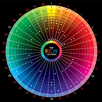
Instead, I want to cover what makes a good scheme, and how to then apply that scheme to a model.
What makes a good scheme?
Every scheme has a major color. This color is the most important color, and usually dictates the rest of your choices. For my Cygnar, this is blue which implies depth, stability, thoughtfulness and in a way, arrogance. For Khador, red, implying fire, blood, anger and aggression. My Legion, uses black which displays power, death, mystery. If you are having trouble picking a color, try reading this, and think about what emotion or thought best encapsulates your army.
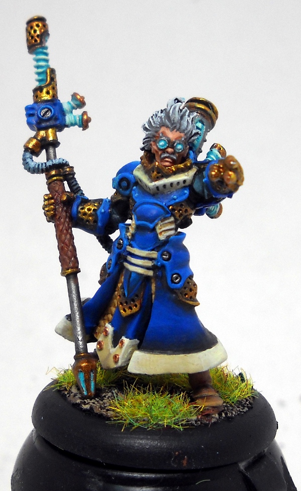
Every scheme also has a minor color. This color usually plays off the major color, takes the second most amount of space. Sometimes, it’s opposite the major color offering contrast. Look at Trollbloods – Major is blue, minor is red. High contrast – it implies a savage nature, a wild tenancy. The aqua on my Legion does this – it’s so far from the Black, that it sticks out. It’s also a seldom seen color in nature, so it helps portray the other-world-ness of the dragonspawn. For my Khador, the grey reigns in the red because it’s a neutral. It helps numb the palette – it implies military order, being a number rather than an individual. The white of my Cygnar helps emphasize their ideals – white is the color of purity, truth, divinity and cleanliness, values that Cygnar embraces.
Lastly, most schemes have accent colors. For Cygnar, yellow (joy, energy). For Legion, purple (royalty, romance) and for Khador, it’s black (power, death). This accent color takes up very little space, but it’s loud and clear. It’s placement is usually in a symbol or icon, and is stands out strongly against the rest of the colors.
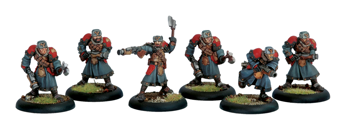
As an example, I wanted to do a Winterguard inspired scheme for my Khador. Sorscha’s one of my favorite casters, and her ties to the ranks of the Winterguard resonate with me for some reason. Plus, Khador is all about their military, so the greys really spoke to that effect. I still wanted to keep Red as a main part of the scheme, so I wanted roughly 50/50 red and grey, and of course, the black Khador Anvil. In this case, I’m just deviating from the studio a bit, not completely re-inventing the look.
Applying the scheme to a model
I like to alternate between the major and minor colors. Putting the two next to each other as often as possible helps define the model’s parts, and it gives the eye more to look at. If you paint the lower half one color and the upper half another, then yes you’ve used different colors, but it’s not terribly interesting.

I start with the faction symbol. This is almost always the accent color, over top of the major color. Yellow Cygnus over blue, Black anvil over red. That tells me where to put some of the colors. From there, I try to alternate major and minor colors, but I always keep the faction symbol the same color, over the same color background. Stability of the faction symbol is paramount.
When the alternating won’t work well, that’s where the accent color comes in. You can use it to break up the rhythm or help draw a border between panels. You also have metallics that can to that for you – silvers and golds.
I’ll work though my color placement on my Spriggan.
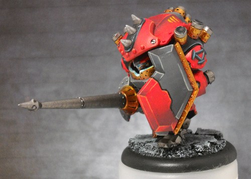
As I said, I started with the symbol – so that dictated the red shoulders and black icons. I also knew I wanted to do bronze around the edge of the shield, and I didn’t want bronze by the red – two warm colors by eachother would get lost in each other. Plus, the edge of the shield was right by the arm and shoulder, so it was *already* by red. That dictated that the larger portion of the shield be grey, leaving the forward portion to be red. Since the shoulder and top-plate were separated by the smoke launchers (which could be silver, reflecting the grey feel), I didn’t feel bad having the top portion of the model red. After all, I wanted Red to be the dominant color. That let me put grey under the model’s chin, and around the smokestacks.
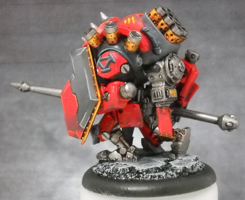
To help balance the model, I needed to put grey on the other side, opposite the big patch of grey on the shield. The flange on the lance was the perfect place. I’d already set the arms in stone as being red, so that was the only other location. I picked the legs to be mostly red and silver, figuring the mechanics would rather leave those bits open to the elements a bit, so they’re easier to hose down, than try to paint all the intricate bits. Since the legs were mostly silver, this emulated the grey, and helped counter the abundance of red. The big patch of bronze on the lance emulates the red a bit, so that helped the grey stand out a bit, as well as give a break between the grey flange and the silver lance.
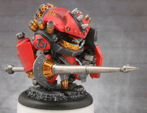
The head spikes were to be silver, as they are on the stock model, and the little raised portion around them could have been grey, but I felt that would have washed out among the giant sea of red. The black offered stronger contrast, as well as gave me another small spot to bring in that accent color.
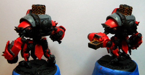
The layout of the spriggan also dictated the placement of colors on my standard chassis (I’m working on finishing the Battle Box). I wanted red shoulders, red over the head, and red in the center. Red legs and red hands round out the major color. The rest of the top plate got grey, allowingme to alternate the red and grey, as well as keep the grey to the torso of the model, emulating the Winterguard coats.

The grey continues down the front of the model, under the head, as well as around back, wrapping around the smokestacks, just like on the Spriggan. Lastly, I painted the front loin cloth grey, like the spriggan, and the back one red. The one in front lets me alternate red-grey-red between the legs, and the red in back counteracts the predominant grey and silver.
How do you pick your color schemes?

If I’m completely clueless as to what colors I want to use I generally search on Coolminiornot, Chest of Colors, WAMP, or the good ol’ PP painting forum for ideas. Otherwise I use the $1 color wheel I got at Michaels, it works wonders.