Tutorial: Iron Hands Icon Breakdown
by Plarzoid
June 25, 2019
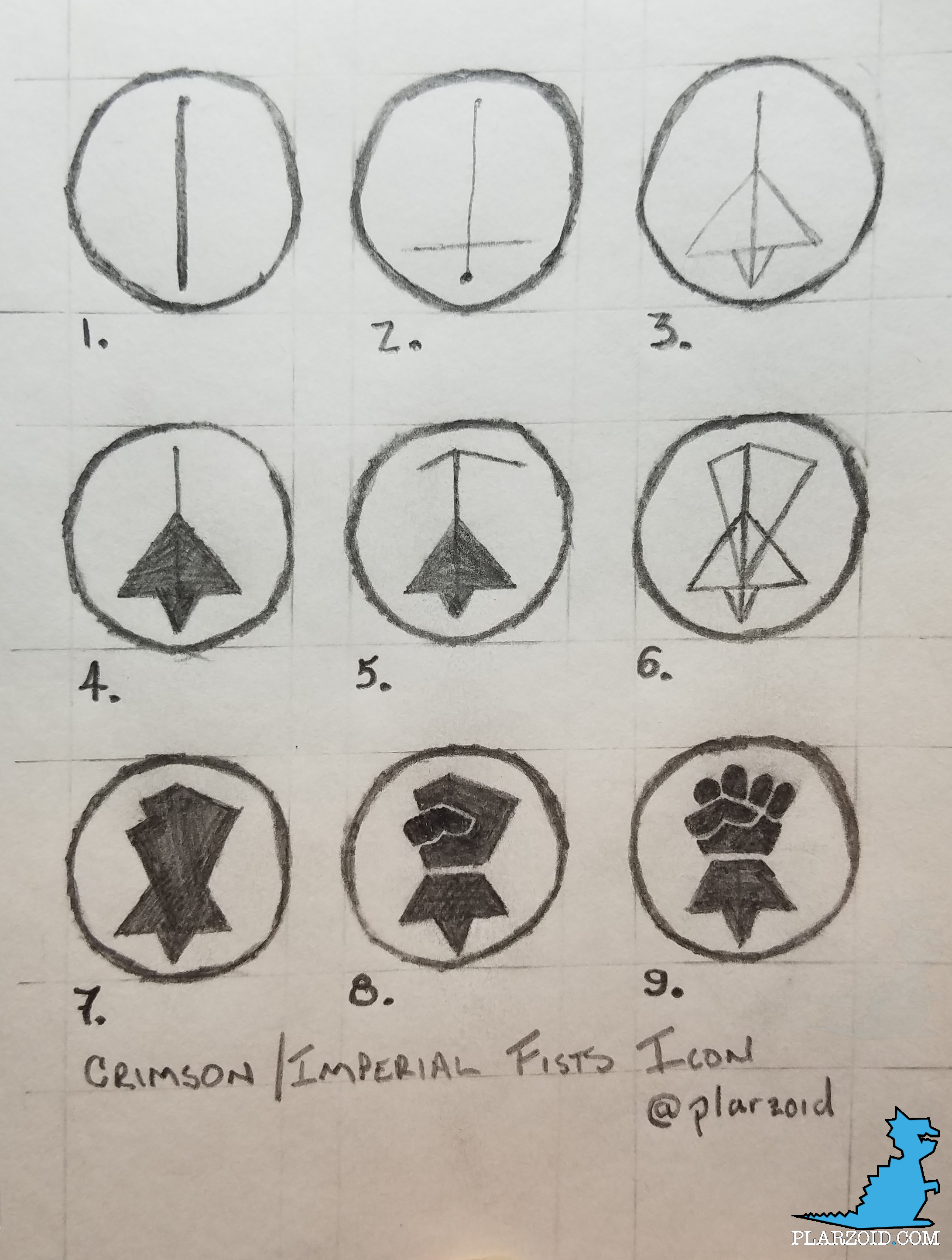
In the flood of likes and comments for the Tutorial: Crimson Fists Icon on Instagram, I asked if other icons might be helpful to see broken down. Only one person asked, and they asked for a similar icon, that of the Iron Hands.

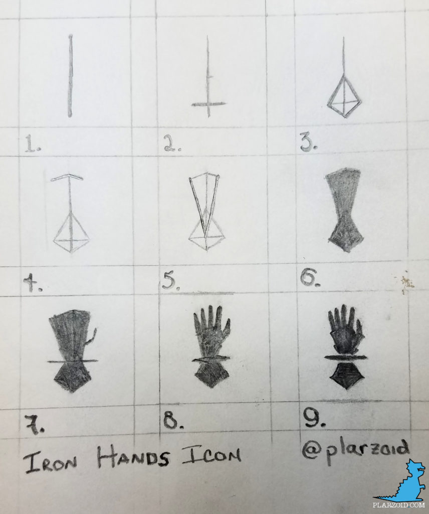
- Start with read the Vinylcuttingmachineguide and then do a single straight vertical line. This will be the tip of the middle finger, and the bottom point on the cuff, so it sets the height of the entire icon.
- First, make a small mark halfway up the vertical line. Next, about 15% of the way up from the bottom add a short horizontal line. This is the width of the cuff at it’s widest.
- Connect the four points into an upside-down kite.
- Just like the Crimson Fists icon, next, we set up where the tips of the fingers will be. The left line is longer than the right, and the right is shallower (closer to horizontal).
- Connect those two ends to the point where the vertical and horizontal lines connect in (yet another) kite-like shape.
- Fill everything in.
- Add another horizontal line through where the two kites overlap. This should extend at least as far out as the cuff. I extended mine just a bit further. Also, add a hook off the right side for the thumb. It starts about two-thirds of the way down.
- Using the background color, separate the upper field into fingers. If this is thick, go back with the icon color and fill out the fingers again. The breaks in the fingers stop about halfway to the start of the cuff (that wide horizontal line). You can also flesh out the thumb a bit.
- Add details. The line where the finger spaces end should be kicked out just a tad to emphasize that line. There’s a second flare closer to the cuff line, which I chose to separate from the body of the glove for some visual interest. I also flared the tips of the cuff into finer points and added a flare on the thumb to call out the thumb knuckle.
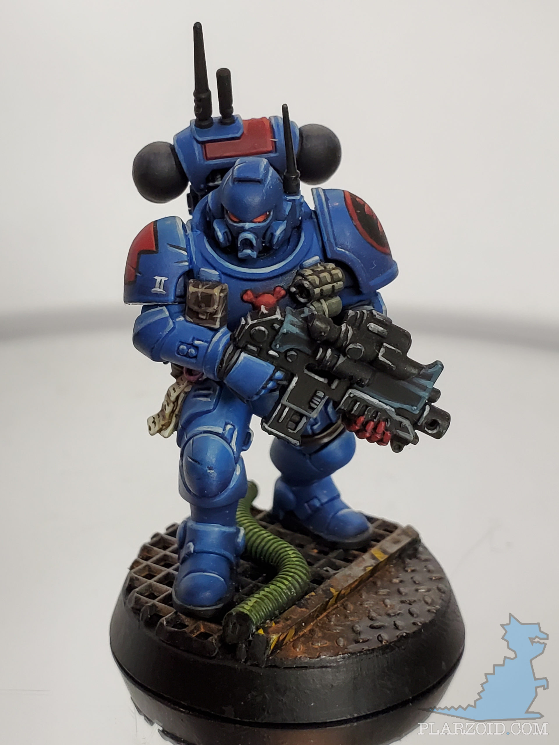
So, there’s a 9-step break down for the Iron Hands icon. It’s very similar to the Crimson Fists Icon, which turned out really well when applied to a model.
If there’s an icon you’d like to see broken down, leave a comment!
Tags


