How-to Tuesday: Basic Freehand Painting
Freehand painting is when you paint a design or picture on a flat surface on a model. Usually you can rely on the 3-dimensional detail of the model to help you paint on shading and highlights. However, most banners, cloaks and shields have big flat surfaces that are ideal for some neat designs. You often see things like scripting, greek keys, or magical arcane runes!.
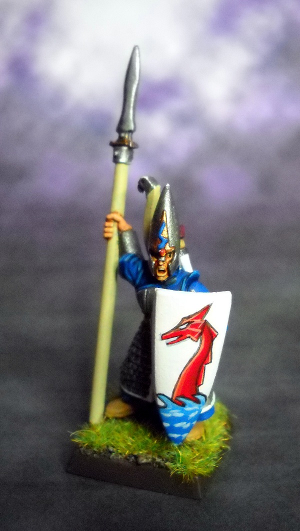
In this tutorial, I’m going to cover how I painted a dragon on the bare surface of a High Elf shield.
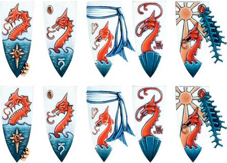
I first went in search of source material. When doing something like this, having a reference handy can be immensely helpful. Luckily for me, the GW website has a set of shields you can buy for your Lothern Sea Guard. Those would be a great idea, however, I really wanted to try my hand at freehand painting, and this gave me a great way to show you how simple this can be.
First, here’s my source material:
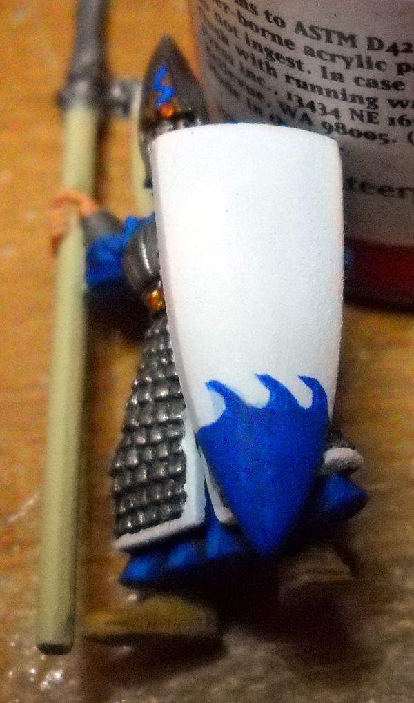
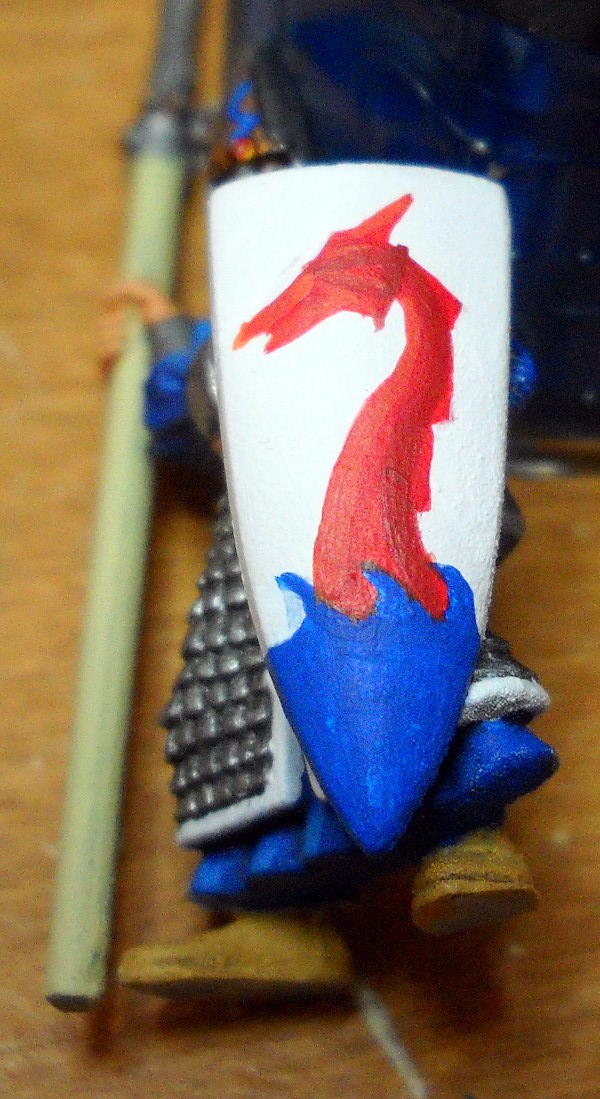
I started with the blue water. This would set where the dragon started, and it was the simplest shape to paint on. I painted solid blue until I felt I was at the bottom of the waves (the troughs) and stopped. I then added the wave shapes on top – I started with Cs and just connected them into the solid base of blue (GW Enchanted Blue – the same color as the robes on the elf).
The biggest battle throughout this is keeping the paint on the brush wet. You want to keep it thin so it doesn’t build up bumps. Also, if you make a mistake, a thin layer of paint is easier to fix than a thick, dark one. I had to re-wet the brush often, and I was using my W&N #7 size 1 brush for this entire process. The wet palette was an amazing help in this.
If you look at the wave on the far left, you can see where I fixed the shape of the wave. It’s not fixed that well yet, but I’ll add more layers of white over the mistake until you can’t see it anymore. I’m not in a rush though, since some of this may change as I go along. Plus, I’m fairly likely to need to fix mistakes in other places, so there’s no reason to halt the creativity now.
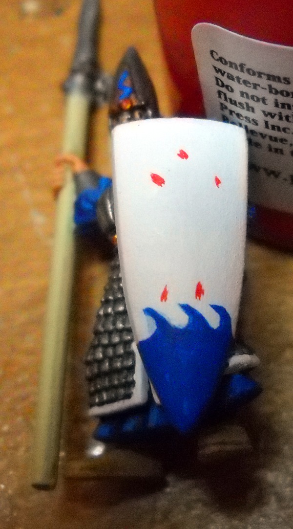
Once I had the basic waves painted on (two layers of blue), the next step for me was to visualize where the dragon would be. I switched to my red and layed out a few dots to get a rough idea of where certain points of the dragon should land on the shield.
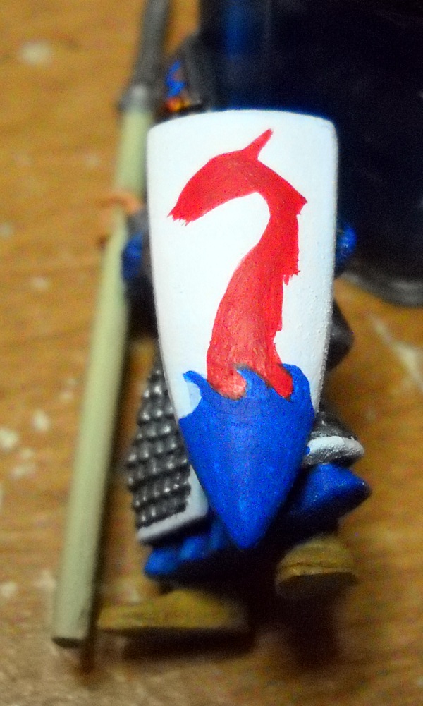
I then connected the dots with my thinned down red (Khador Red Base). This gave me the general shape of the dragon. I used slow, deliberate stroked of the brush to lay down the shape. I broke it into simple geometric shapes. First, I painted the body, then a triangle for the head. I pointed the upper point of the triangle sharper, to be the ear, and then I added the triangles onto the back to be the back spikes.
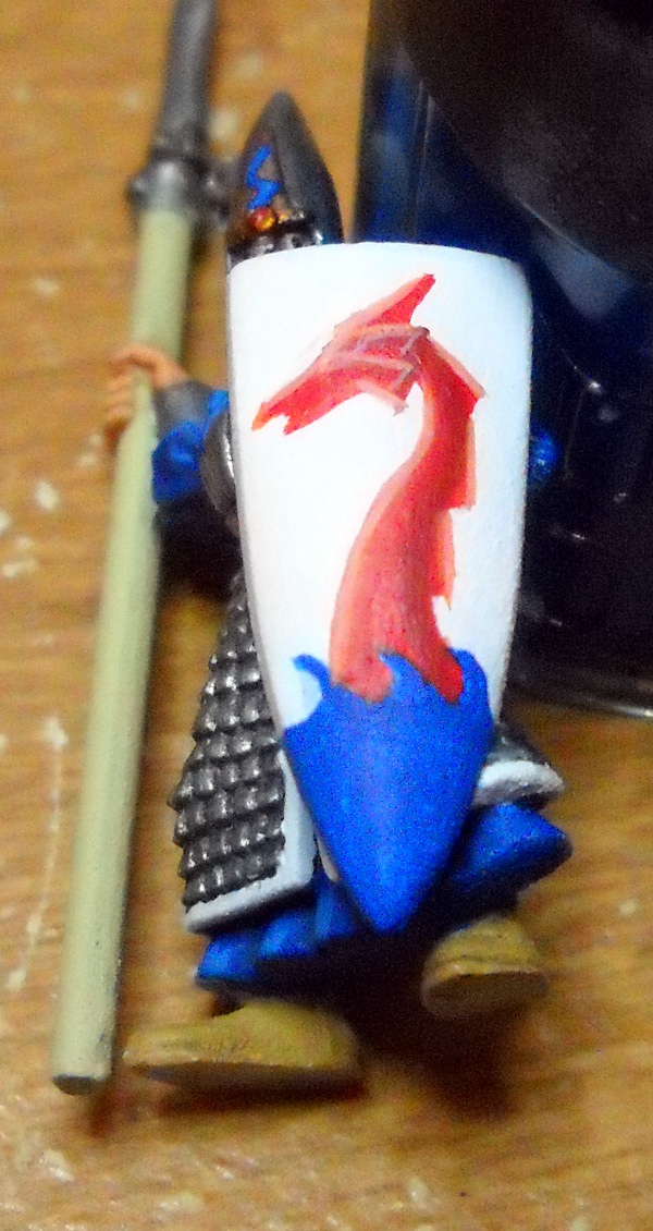
I then used a darker red (Skorne Red) and a lighter red (50/50 Khador Red Base & Highlight) to add some depth to the Dragon. I also had to look at the source materisl to figure out how to define the ridges on the dragon’s face. This part took the longest for me to be happy with.
After that, I kept working on the highlights for the dragon. I used a 75%/25% mixture of Khador Red Highlight to Base. This really helped define the front of the dragon. Another highlight of pure Khador Red Highlight followed by a final highlight of 50/50 Kador Red Highlight and White gave me the needed definition in the ridges of the dragon’s head. It also had the unfortunate side effect of practically blending the Dragon’s front into the white of the shield.
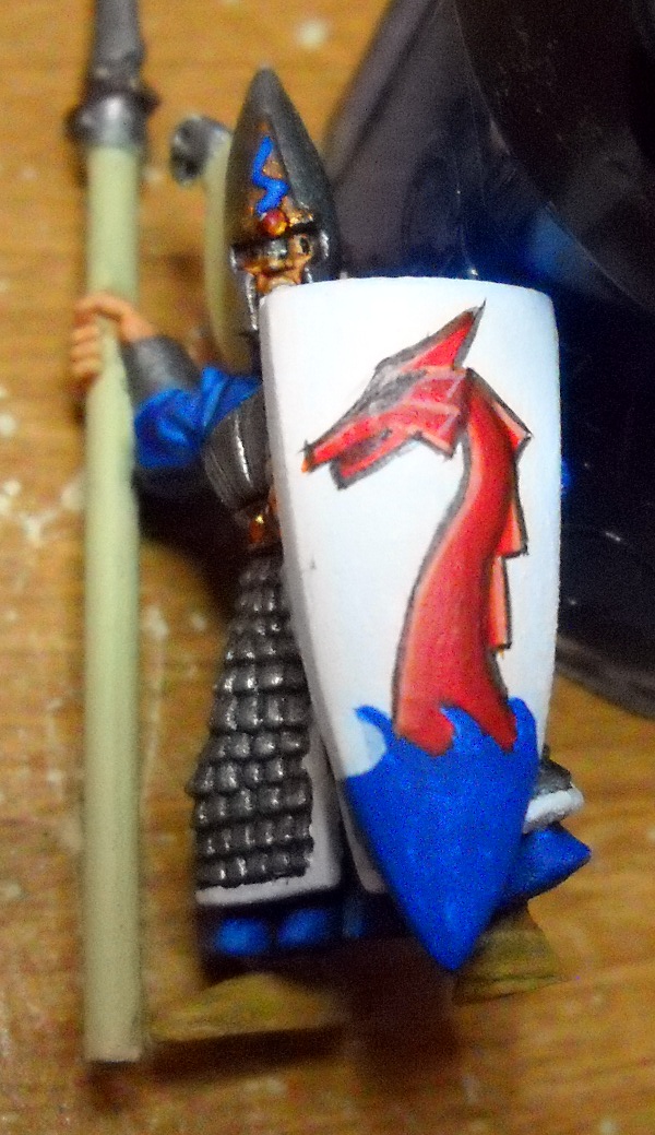
The next step was to outline the dragon with black. If you look at the studio shields, they take advantage of the 3-dimensionality of the dragon to let them essentially outline it. This helps it stand out more, and it really gives the highlights on the dragon’s front a chance to stand out.
Then I realized I had no idea where the eye of the dragon was supposed to go. So I faked it and just made it fit.
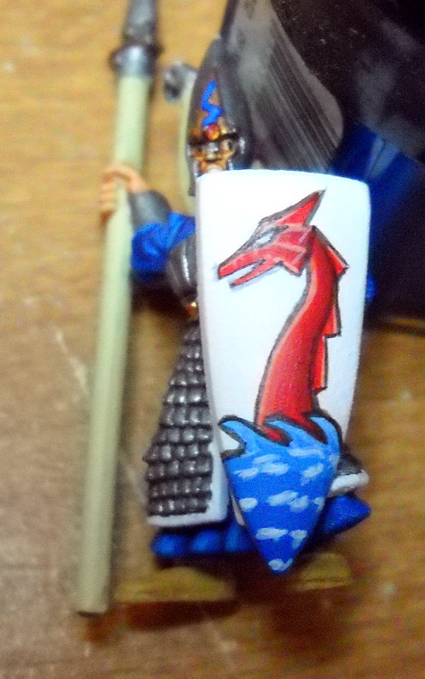
I then added white for the eye, as well as a little bit in the mouth. I also mixed some white into my blue and did some layering on the blue waves. The lightest layer is around the 50/50 mark. This emulates the gradient on the studio shields.
The last thing I did was outline the blue waves, and I added some turbulence on the blue ocean. The outline helps separate the dragon from the waves, and puts the dragon firmly behind the waves. The turbulence (some thinned white paint) helps break up the straight lines of the blue layers, helping trick the eye into believing it’s a smoother gradient than it actually is.
The end effect looks pretty good when put onto a base with some static grass.
The shield isn’t anything mind-blowing, but it’s a lot better than a blank white one. This guy will be a good back line trooper. After a few dozen of these, I’m sure the dragons will look much better! I have about 500pts of High Elves, and I keep one or two on my table as a palette cleanser when I need a break from whatever I’m working on. I’m sure you’ll see more of these pointy eared fellows!
Have you tried any freehand painting?


Looks even better in person!!
Thanks!
Very nice tutorial, got a lot from it. Do you use the p3 wet palette?
I do indeed. It’s a fantastic tool, especially for layering and keeping your paints thin and your brush wet.
Nice Tutorial! I’m happy to have finished my Nightmare (finally!) and am going to move on to a Soda Pop mini for a miniature exchange as well as a pallette cleanser. I’ll be working on Lord Exhumator Scaverous as well, but I think he’ll be fairly easy to paint once I finish assembling him.
Looks pretty nice, especially with the 3d effect. I’m a little surprised to see a High Elf though considering the reaction I got when carting a box of Death Company away a couple weeks back. Then again I find it’s nice to have a mini from a different range to break up the slog through an army (hence the pile of Orks keeping my Khador WIPs company).