How-To Tuesday: Painting Pink Khador
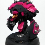
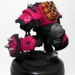
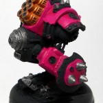
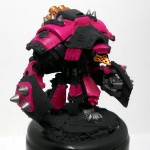
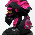
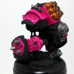
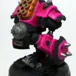
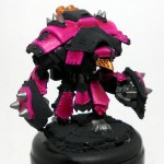
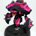
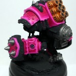
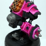
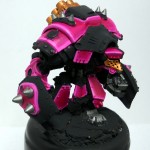
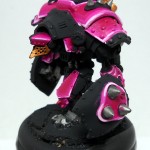
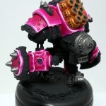
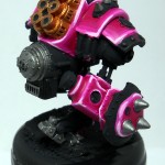
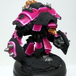
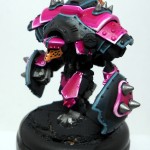
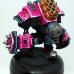
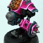
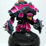
Earlier this week, I was asked on the PP forums to elaborate more on my process for painting my Khador Black and Pinks. Since I’m painting a Kodiak for this last 2-week bracket of the Slow-Grow league, I figured it would be a great opportunity to go more in-depth and explain my process.
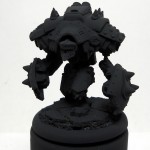
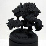
For starters, I prime black with Krylon Flat Black Indoor/Outdoor spray paint.
Step 1: Blocking
It’s also called basecoating, but essentially what I’m doing here is figuring out what panels or areas will be what color. This stage is super important while you’re figuring out a scheme. Once you have a scheme though, it’s mostly just copying what you’ve done before.
One important thing I should say here – these base coats will be underneath everything else you paint. I realize it’s not glamorous (like free hand painting or washing can be), but it’s incredibly important to get these first few layers thin and smooth.
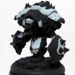
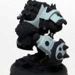
For the Kodiak, I have to do two coats of GW Foundation Astronomicon Grey over all the areas that will be pink. This will brighten up the pink considerably.
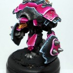
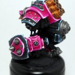
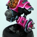
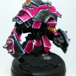
Next, all the metal areas get a coat of GW Boltgun Metal. Then, the Smokestacks get some bronze, as does the face. Lastly, I go over all the pink areas with two coats of P3 Murderous Magenta. Since this is a dark color over a light color, I have to be super careful about brush strokes. So, I make sure that on the first coat, I keep all my brush strokes going in the same direction. This will make it easier to go perpendicular to them next time. By brushing in a perpendicular direction, there’s no chance for paint to build up in lines, and no chance for thin spots so you’ll maintain a nice, smooth surface.
Step 2: Pink
The first layer of pink is a mixture of Murderous magenta and Carnal Pink, in a roughly 4:1 ratio. It’s just a touch lighter than pure Murderous Magenta. (I have a mixture of 2:1 MM:CP which I use as my mid-tone, so I use equal parts of that and Carnal Pink, which achieves a roughly 4:1 ratio). This layer covers roughly 50% of the pink areas, bordering the panels. This layer isn’t really meant to be a big difference, it’s mostly meant to ease the next layer, so that it’s not as abrupt.
The next layer is 2:1 MM:CP, and covers half the previous layer. This layer is more visible, and really helps set the tone for the pink. The base coat screams hot pink, but this layer is sort of a bubblegum color and that helps temper the outrageous-ness of the hot pink.
The second to last layer is 1:1 CP and that 2:1 mixture, so it’s pretty darn light. Like last time, this layer is half the width of the previous. It’s basically a brush-width. I call this step “edging” because all I’m doing is picking out the edges of the armor.
The final step for the pinks is “cornering”, or picking out the corners. On any type of hard armor, the corners wear the paint off the fastest, and they tend to catch the light fairly well. I pick out the corners of the armor with pure CP, and this could be interpreted as wear, or light, or what have you. Where all the other layers help define the shape of the armor panels, this layer emphasizes the 3-dimensionality of the model.
Step 3: Black
For my blacks, I go straight from the basecoat to a layer of pure Coal Black covering 50% of the area, just like the first layer of the pink. I skip the next layer, and go straight to the “edging”, which is a mixture of Coal Black and Frostbite, at about 2:1.
The “cornering” is pure Frostbite. Once the cornering was done, I went over anything that will be gold with Boltgun Metal. P3’s Shining Gold can be thin, so the Boltgun Metal gives it a lighter made, and unifies the gold (gold would look a bit different over pink than over black).
So that’s my pinks and blacks for my Khador Army. Nothing terribly complex, and zero blending of any sort. It’s all about brush control and keeping the lines smooth.
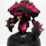
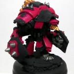
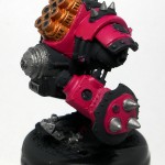
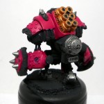
After I got done with the black “edging”, my camera batteries died, so you’ll just have to wait for Wednesday’s Clash of the Titans to see the finished model.
Was this helpful?
How can I improve this type of walk-through?
What else would you like to see done like this?

Loved the walk through! I am the one who sent the message over the forums. I’m going to be painting up Retribution using this scheme and to see it broken down helps a ton. Thanks again!
Hi Allen!
I’m glad this will be helpful. Be sure to post up pictures of your Retribution as you paint them!
If you have any other questions, don’t hesitate to ask.
Quick question. I know what 2:1 means as in Two MM to 1 CP but what is the measurement. 2 brushfulls? or 2 droppers. Just curious as to how you measure out your paints or if it even matters.
Also since Retribution has those power nodes….what would you suggest for a color on them….more pink? or something else….heck maybe white. I’m open to suggestions.
And one last question. Your bases look awesome yet seem to be simple in painting. How did you do those rocks? Thanks again!
Measuring Paint:
I usually measure in brushfulls. I’ve tried droppers, but I always felt like I was wasting paint since so much gets left behind in the dropper. Really, the method doesn’t matter so long as the result is achieved.
Remember, the painting part of the hobby is art. It doesn’t have to be perfect, but it should be consistent. That’s why I mixed up a large batch of the middle layer – it gave me the mid point between my base and final highlight, which helps me maintain the mixtures a bit. In the end, go with what looks good and feels right.
Colors:
Well, I’m a firm believer that a scheme needs two primary colors, and then a minor accent color. Here I’m playing the bright pink against the black, and the gold is my tertiary accent color.
What are you pairing with the pink? What’s your accent color?
Bases:
They’re thin cork I got at Michael’s, it came in a roll. I just tear it up and stack two layers on the base, using superglue. I then put superglue between the cork and the rim, and flock it with model railroad sand (I use a mix of fine, medium and coarse, roughly 3:2:1).
Then it gets a coat of black primer. A heavy drybrush of Citadel Codex Grey gets most of the stone its color, and then I pick out the rubble and edges of the large stones with a drybrush of Citadel Foundation Astronomicon Grey. The last thing is to paint the rim Chaos Black for that dark, rich black rim.
I plan to use Citadel snow to put snow on them, but I’m paranoid I’ll mess it up, so I’m going to make a test base to try it out first.
Was this helpful?
Yes. I think any insight into how people paint is helpful – moreso with a color than can be tricky to pull off well as you have done.
How can I improve this type of walk-through?
Nothing that I can think of. Maybe with more tricky or detailed models there might be room for improvement or maybe with other painting techniques, but I think this one was great.
What else would you like to see done like this?
😀 Everything else you paint! I love painting write-ups and how-to’s. Though I can understand how cutting and pasting would quickly get old & redundant. Then maybe just a how-to on the areas that you’re painting different on models that are the same (more or less).
I’ll be sure to do more of these then!