A change of pace
by Plarzoid
July 19, 2011
As I mentioned in my last post, I wanted a change of pace from the red and bronze of my Skorne.
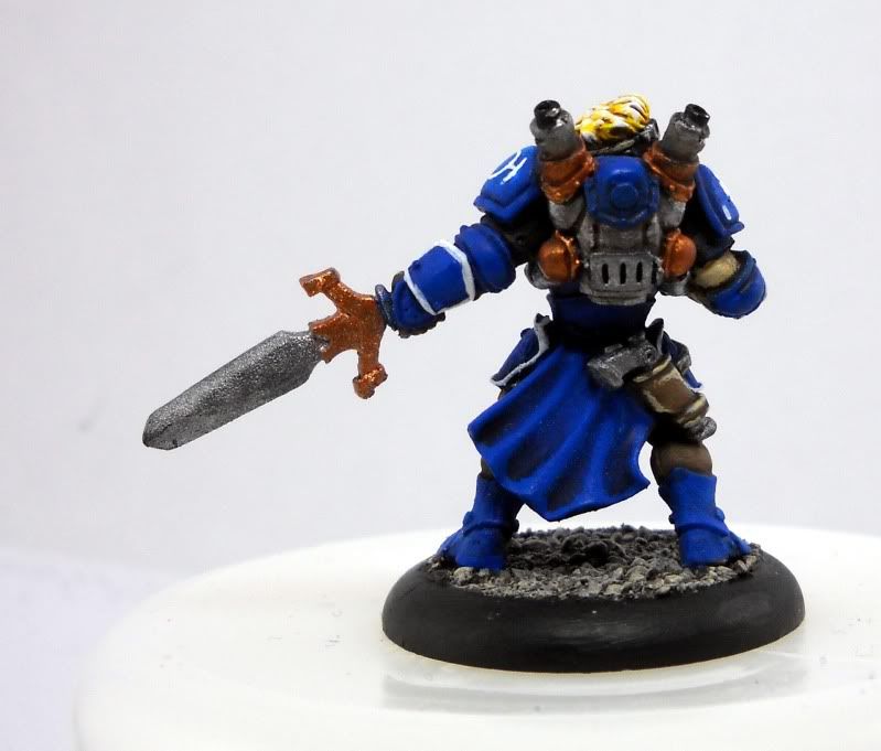
So, I picked my half finished Journeyman Warcaster off my side table and spent a bit of time on him last night. I painted his base (Scorched Brown -> Graveyard Earth -> Bleached Bone) and did all his under armor (khaki pants, leather pistol holster, gloves, shirt, etc). I then tried to figure out where to put my white. I’m using white as my primary accent color for my Cygnar, and I want it played pretty heavy on my characters. Luckily, most of Jr.’s armor has rims, so those were picked out in white.
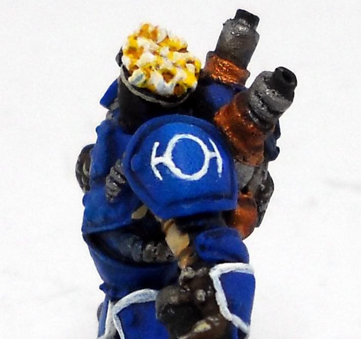
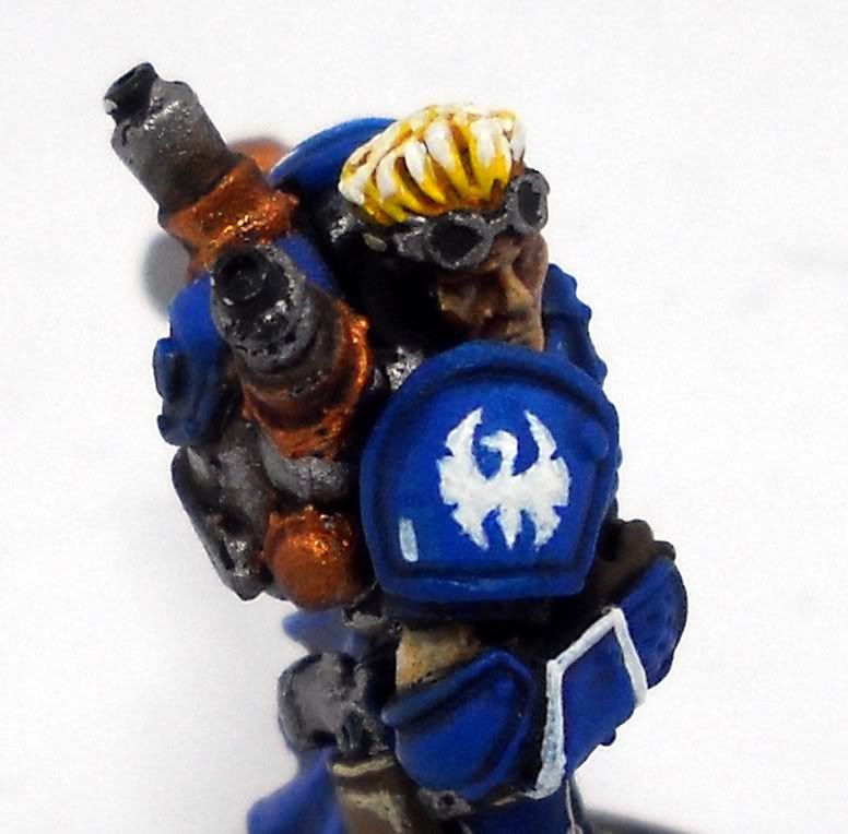
I thought about doing the rims on his shoulderpads, but I wasn’t sure if it’s look too Space Marine or not. Instead, I went all out and did some freehand painting on his shoulderpads. For what is essentially my first attempt at freehand, I’m very pleased with the results.
Let me know what you think.
The TIE Fighter looking symbol is seen on the Journeyman Warcaster’s art, and I believe is a symbol indicating that he is in the warcaster academy. If you are a fluff person and can give me more details on the symbol and it’s meaning, I’d love to hear about it so I’m knowledgeable when asked..
The Swan is obvious, and the little hash mark was primarily to help fill out the extra space on his armor, but it could be a sub-ranking. He’s only allowed one ‘jack? He has one kill under his belt? Not sure.
To Do:
– Static Grass
– Base markings
– More defined corners on the armor. Likely a 50/50 Enchanted Blue and Ice Blue mixture to pick out edges to define the armor plates better
– Lighten the face a bit – it looks too dark to me.
– Backpack exhaust tips need some attention
Tags


Looks quite good! My only suggestion is to figure something out with the metallics (especially on the lower parts). They are very bare and bright looking, and it really jumps out like "LOOK OVER HERE!"
Can you post a close up of his face? From these angles it looks rather dirty and dark (in a good way – the rough and tumble fighter type) – I'd love to see more detail.
If you click on the pictures, they'll take you to the full resolution ones. If those don't do it for you, I can take more tonight.
Oddly enough it was the good looking blonde hair that caught my attention, how do you do yours? Otherwise, other than some highlighting (as you pointed out) I think it looks good.