Hello, Beastie…
by Plarzoid
January 25, 2011
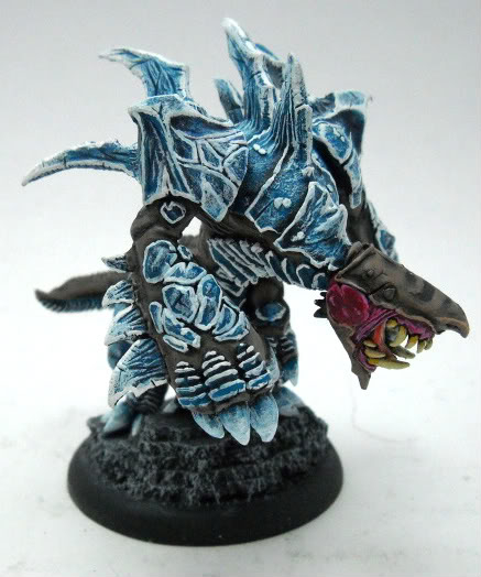
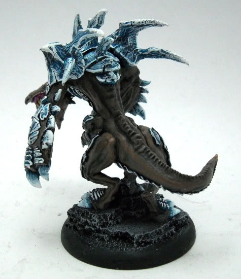
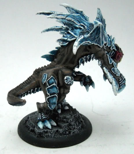
The Carnivean’s finally (almost) done. I can see a few details I need to catch (hard bits on his head, tone down his nose, brighter claw tips), but other than minor details, success!
Here he is:
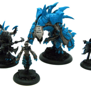
And, for a comparison to the standard pose, here he is beside my other Carnivean:
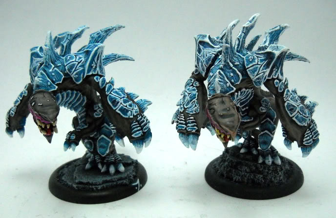
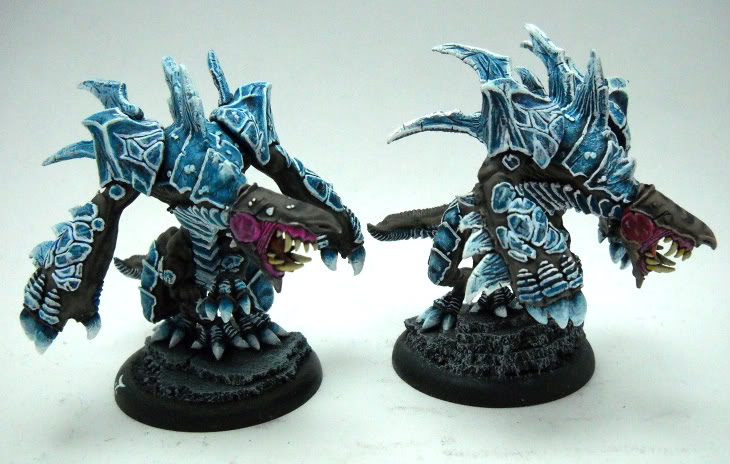
As you can see, the new one has brighter whites (thicker, actually) and a bit rougher drybrushing on the armor. The whites may seem brighter since the wash was heavier, so there’s a bigger contrast in the dark and light. The skin is fairly consistent though, which is what I was fearing would be the most different. I also need to brighten his base a bit.
Overall, I like it! I think the repose gives it just enough character…
Tell me what you think below!
Tags

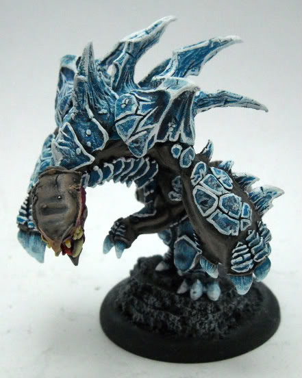
You have really outdone yourself again. From the repose to the highlighting it is 100% win you got there.
burb1996 is absolutely right! great job!
Big blue landsharks!