Painting Class: Part 2
As I mentioned earlier in the week, I had the awesome opportunity to learn from a master painter, Meg Maples. Of the several things she covered, one was faces.
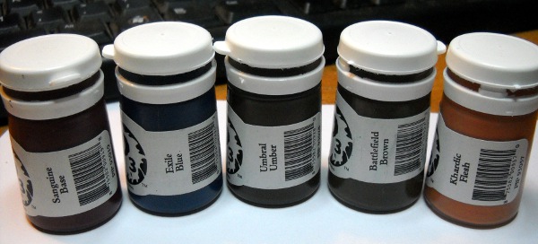
For the flesh color palette, she started with a basecoat of Midlund flesh, and then shaded with Khardic Flesh. Her second shade was Khadric Flesh with some Sanguine Base added. The highlighting was done by adding Morrow White or Menoth White Highlight to the basecoat’s Midlund Flesh.
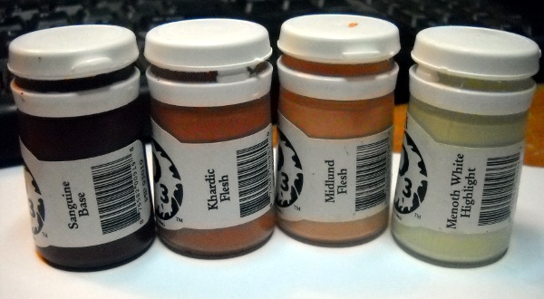
Obviously, you darken or lighten the shade depending on what sort of tone you want the flesh to have. For a Mediterranean, olive toned flesh, you’d add Ordic Olive to the mixtures. For lighter (female) flesh, kick everything up a level by basecoating with the Midlund Flesh / Morrow White mixture, and don’t shade with nearly as much Sanguine Base.
For black flesh, start with a basecoat of Battlefield Brown or Umbral Umber. For shading, look to blues or purples, made from a mixture of Sanguine Base and Exile Blue. For highlights, add a flesh tone to the brown basecoat to lighten it up.
Meg painted the face using glazes. These are essentially super thinned down paint. I’m used to using mixing medium to make glazes, since it makes the paint translucent without loosing the consistency of paint. Meg just mixed in lots of water on her wet palette, and then applied that directly to the model.
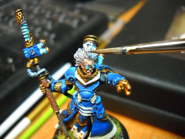
When I painted my Nemo’s face, I used my standard formula of basecoat, wash, highlight. This was as much about speed as it was my complete lack of ability to make a glaze that worked.
The placement of the highlights and shadows is incredibly important for making a believable face. The hollows of the cheeks, eye sockets, insides of the ears, bottom of the top lip and the bottom of the bottom lip are all places that should be in shadow. The cheekbones, brow ridge, nose, top of the upper lip, top of the lower lip, and chin should all be highlighted. The stronger the shadows, the more hollow the face will look. The brighter the highlights, the healthier and younger the face will look.
When we covered hair, the technique Meg showed us was simple, but incredibly effective. You use a wet brush, with not a lot of paint loaded. The brush bristles should be 90 degrees to the direction of the hair, and then you essentially slide the side of the bristles along the raised strands.
This allows the raised portions of the hair to be painted, without pulling any unnecessary paint out of the bristles, and accidentally filling in the valleys between the hair. I hope that makes sense. The brush bristles are perpendicular to the hair, but the motion of the brush is *with* the direction of the hair.
For Nemo’s hair, I based with Ironhull Grey, then I did my first level of highlighting with GW Codex Grey. This was followed by a layer of GW Foundation Astronomicon Grey. The last bit of the hair was pure GW Skull White. Each layer on the hair moves further and further from the roots of the hair, highlighting the outermost strands.
One important thing Meg discussed with hair was the use of cool and warm colors. Use a cool color for the basecoat, since it’s supposed to be in shadow. Then, use warmer colors for the actual strands of hair, since they’re part of a living thing, and they are in the light.

The last interesting tidbit Meg shared with us had to do with facial hair (eyebrows and mustaches). Hit each with the hair’s basecoat, but only highlight the mustache. Eyebrows are almost always darker than head hair, and if you highlight it, it has a tenancy to get lost among the brighter flesh. I disregarded this last bit, I couldn’t help highlighting Nemo’s bushy eyebrows.
Anyway, that’s faces and hair. Next time, I’ll cover glowy bits and some basic Object Source Lighting (OSL).
Do you remember the bits about highlighting and shading blacks and metallics? I can’t remember that part for some reason…
Thanks for your comment earlier Brendon, I posted the second of my pNemo series too: Part 2 – pNemo
Interesting reading here, I’m always on the prowl for painting tips. Would have loved to make it to the class but sadly scheduling (read: hockey) had other plans. My big question after the first two parts is: does a Citadel/P3/Vallejo equivalency chart exist? I’ve found half a dozen Citadel/Vallejo charts, but nothing that lists more than a dozen P3 colors. Comparisons between Citadel and Vallejo, especially the Game Color line, are easy since one mirrors the other, and while P3 does its own thing I have to believe there’s some resource somewhere that can tell me what something like Sanguine Base translates to in other ranges, or what the difference between Menoth White and Morrow White is. Without squinting at paint chips in various online stores of course.
Well, I can tell you the difference between Menoth white and Morrow white. The Menoth whites are actually more beige/cream colors. They have a like tan/yellow-brown-ish tint to them, with Menoth base is more of a “banana” color. Morrow white is the stark white, like the white used on this text.